Trifold Brochure Project
No Problem Movers Brochure
This tri-fold brochure for No Problem Movers was built around one central goal: take what can be a stressful, uncertain experience — moving — and make it feel organized, approachable, and trustworthy. Every design decision served that purpose.
Establishing the Visual Identity
The color palette anchors the entire piece. A deep navy blue dominates the background, projecting professionalism and reliability — qualities you want from people handling your belongings. This is offset by clean white typography and selective use of lighter blue gradients to create visual depth without clutter. The result feels established and confident, which reinforces the company's "since 1980" messaging.
Panel Strategy and Information Architecture
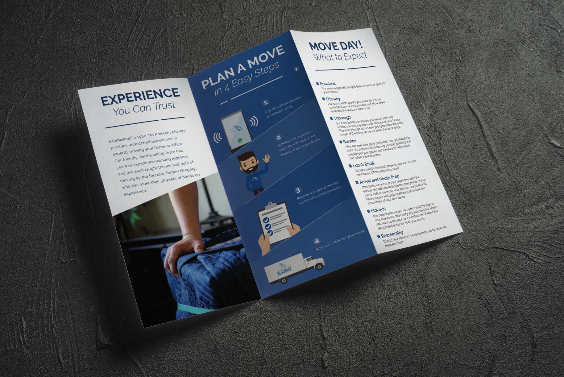
The tri-fold format was used deliberately to control how information unfolds. Each panel has a distinct job:
Panel 1 — "Experience You Can Trust" serves as the credibility builder. A background photo of a mover handling items with care grounds the panel in reality, while the copy introduces the founder's 35+ years of experience. This is your handshake — it answers "why should I trust these people?" before anything else.
Panel 2 — "Plan a Move in 4 Easy Steps" is the conversion panel. It breaks down the process into a simple numbered sequence using illustrated icons — a phone, a clipboard, a checklist, a calendar. The choice to use cartoon-style illustrations here was strategic: they simplify what could feel like a complicated process and give the brand a friendly, human personality. The step-by-step flow moves vertically down the panel, creating a natural reading path that mirrors the progression from first call to scheduled move date.
Panel 3 — "Move Day! What to Expect" is the most text-heavy panel, and that's intentional. By the time someone reads this far, they're already interested — now they want details. The content is organized with bold keyword headers (Punctual, Friendly, Thorough, Service, Lunch Break, Arrival and House Prep, Move-In, Reassembly) each followed by a brief explanation. The small navy square bullets create a consistent visual rhythm that makes a dense panel feel scannable rather than overwhelming.
Typography Hierarchy
The type system does a lot of heavy lifting. Large serif-style headlines ("EXPERIENCE," "PLAN A MOVE," "MOVE DAY!") command attention and establish each panel's topic instantly. Subheads shift to a lighter, more elegant italic treatment ("You Can Trust," "What to Expect") that softens the tone. Body copy is set in a clean, readable sans-serif at a comfortable size. This three-tier hierarchy means a reader can get the gist of the entire brochure in about three seconds just from the headlines, then choose to go deeper.
Illustration and Imagery
The mix of photography and custom illustration is worth noting. The left panel uses a real photo to establish authenticity — these are real people doing real work. But the center panel switches to friendly, approachable character illustrations (the waving mover figure, the moving truck) that make the brand feel personable rather than corporate. This combination strikes a balance between "we're serious professionals" and "we're people you'll enjoy working with."
Layout and White Space
Even on the densest panel, the design maintains breathing room. Text blocks are given generous margins, and the step-by-step icons in the center panel are spaced to avoid visual crowding. The gradient backgrounds help separate content zones without needing hard dividers, creating a smooth visual flow across the entire interior spread.
The Strategic Takeaway
The brochure works because it respects the reader's journey. It opens with trust, simplifies the process, then delivers the details — mirroring exactly how someone moves from "I'm considering hiring movers" to "I'm ready to book." The design doesn't just look polished; it's structured to move someone toward a decision.

